14 Color Schemes to Transform Your Interior Design Mood Board
This post may contain affiliate links which means we may receive a commission for purchases made through links. Read more on our Affiliate Disclosure Page.
Picture this: You’re standing in the middle of your living room, surrounded by blank walls and uninspired furniture. The potential is there, but… something’s missing. That spark, that je ne sais quoi that turns a house into a home. Well, I’ve got news for you – it’s all about color, baby!
Did you know that the right color scheme can have a positive impact on your home’s resale value? It’s true! But more importantly, it can transform your space from drab to fab, from meh to marvelous. So, grab your paintbrush and let’s dive into 14 color schemes that’ll breathe new life into your interior design mood board.

1. Warm and Cozy: Earthy Tones
Ah, earth tones – nature’s comfort food for the eyes. Think rich browns, warm terracottas, and soft oranges. These colors wrap around you like a cozy blanket on a chilly evening.

To nail this look, start with a base of creamy beige. Then, layer in deeper browns for your larger furniture pieces. Sprinkle in some terracotta accents – maybe a statement wall or some throw pillows. Finally, add pops of burnt orange in your accessories.
2. Minimalist Monochrome
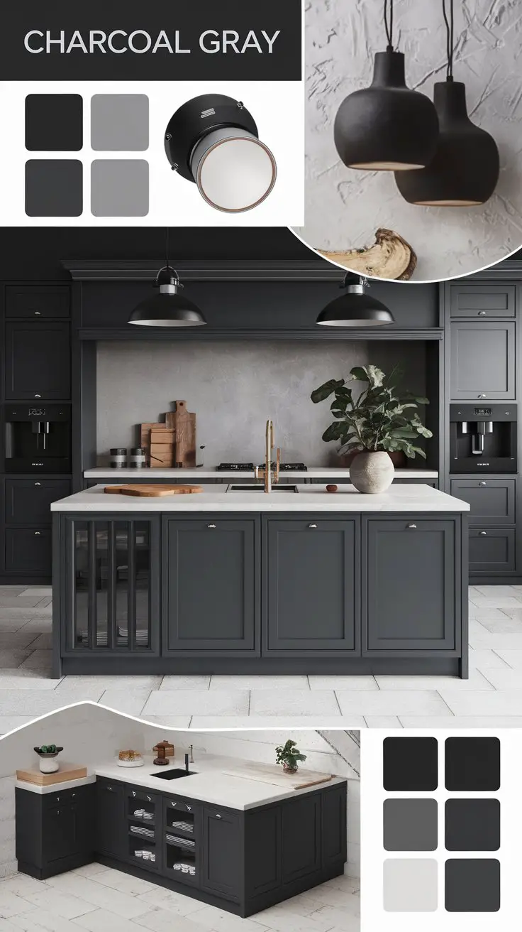
Less is more, they say. And boy, does monochrome prove it! This scheme is all about variations on a single color, usually in shades of gray, white, and black.
Start with a crisp white base for your walls. Then, layer in different shades of gray – from light silver to deep charcoal. Use these varying tones in your furniture, rugs, and curtains. For a touch of drama, add black accents in your light fixtures or artwork.

The key here is texture. Without it, your room might feel flat. So mix it up! Combine sleek surfaces with plush fabrics, rough-hewn woods with polished metals.
3. Coastal Calm
Close your eyes. Feel the sea breeze on your face. Hear the waves lapping at the shore. Now open them – you’re in your living room, but it feels like a beachside retreat.
That’s the magic of a coastal color scheme. It’s all about blues, whites, and sandy beiges. Start with a base of crisp white – it’s like the foam on the crest of a wave. Then, bring in different shades of blue. Navy for your larger pieces, aqua for your accents.

Don’t forget the beige! It’s like sprinkling sand throughout your room. Use it in your flooring, in woven baskets, or in your window treatments.
This scheme works wonders in smaller spaces. It opens up the room, making it feel as vast as the ocean itself. Plus, it’s incredibly versatile. Dress it up for a sophisticated nautical vibe, or keep it casual for a laid-back beach house feel.
4. Vibrant Bohemian
Who says you can’t have a rainbow indoors? The bohemian color scheme throws caution to the wind and embraces all the colors of the spectrum.
This isn’t for the faint of heart. It’s for the bold, the adventurous, the free spirits among us. Start with a neutral base – white or cream walls work best. Then, go wild! Bring in jewel tones like emerald green, sapphire blue, and ruby red.

The key to making this work is balance. Too much, and your room will look like a circus tent. Not enough, and you’ll miss the boho vibe entirely. Try this: choose one dominant color for your larger pieces, then use the others as accents.
This scheme tells a story. Each piece feels like a souvenir from a far-off adventure. It’s perfect for those who see their home as a reflection of their colorful life experiences.
5. Scandinavian Simplicity
Ah, Scandinavia – land of IKEA, hygge, and interiors that make minimalists weep with joy. This color scheme is all about creating a sense of space and light, even in the darkest of winters.

The foundation of this look is white – and lots of it. We’re talking walls, ceilings, floors – you name it. But before you start yawning, hear me out. This isn’t just any white. It’s a canvas for subtle pops of color and texture.
Bring in pale woods – think birch or ash – for your furniture and flooring. These add warmth without overwhelming the space. Then, sprinkle in hints of gray. A dove gray throw here, a charcoal pillow there.

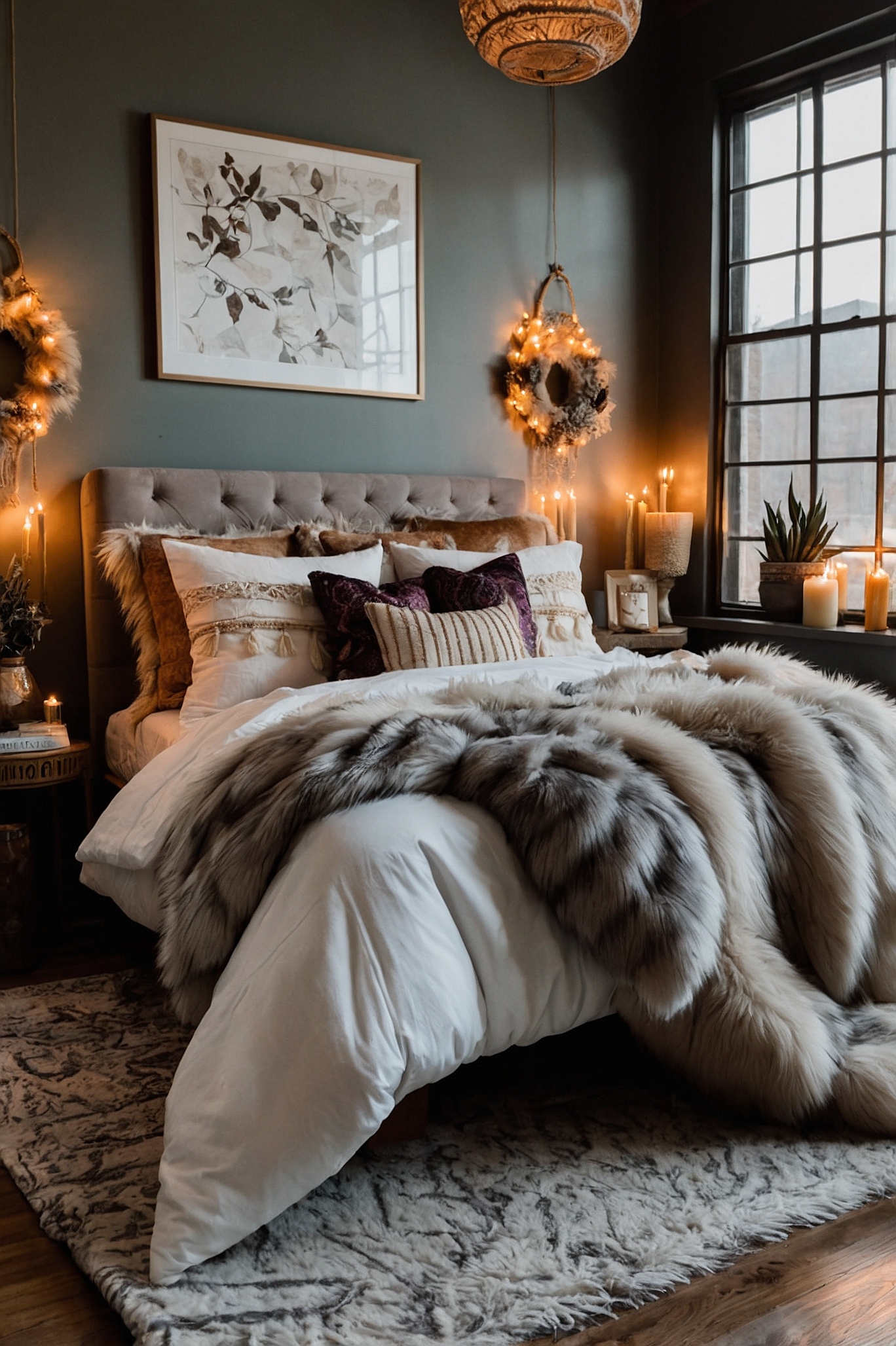
The beauty of this scheme is in its versatility. It’s like a chameleon, changing with the seasons. In winter, add chunky knit blankets and faux fur rugs for extra coziness. Come summer, swap them out for lightweight linens and fresh greenery.
Remember, Scandinavian design isn’t just about color – it’s a philosophy. It’s about creating spaces that are functional, beautiful, and deeply connected to nature.
So don’t be afraid to bring the outdoors in. A few well-placed plants can do wonders.
6. Dramatic Contrast
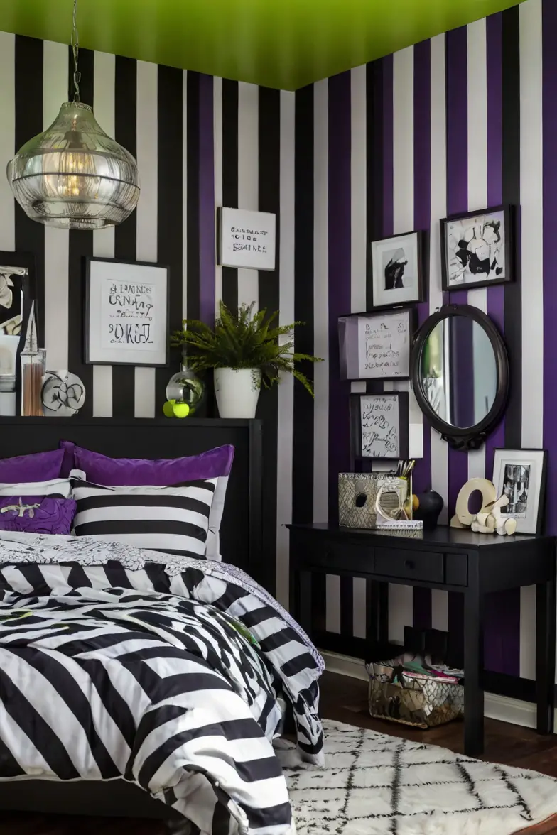
Ready to make a statement? This color scheme isn’t whispering – it’s shouting from the rooftops! We’re talking high-contrast, baby. Black and white, with pops of bold color that’ll knock your socks off.
Start with a base of stark white walls. Then, bring in the black – and don’t be shy about it. A black leather sofa, black-framed windows, maybe even a black accent wall if you’re feeling daring.

Now, here’s where the magic happens. Choose one bold color – let’s say fire engine red – and use it sparingly but strategically. A red vase here, a red throw pillow there. It’s like adding a cherry on top of a perfectly monochrome sundae.
This scheme isn’t for the faint of heart. It’s for those who like their coffee black, their music loud, and their style unapologetically bold. It’s dramatic, it’s daring, and when done right, it’s downright delicious.
7. Pastel Paradise
Who says pastels are just for nurseries? This color scheme takes those soft, dreamy hues and gives them a grown-up twist. Think of it as a sorbet for your eyes – refreshing, light, and oh-so-sweet.
The key to making pastels work in an adult space is all about balance. Too much, and you’ll feel like you’re living in a cotton candy machine. Not enough, and you’ll miss out on that soft, dreamy vibe.

Start with a base of white or very light gray. Then, layer in your pastels. Soft pink, mint green, baby blue – they’re all invited to this party. Use these colors in larger pieces like sofas or curtains.
To keep things from getting too saccharine, add in some contrast. A few black accents can ground the space and add some much-needed edge.
This color scheme is perfect for those who want their home to feel like a breath of fresh air. It’s light, it’s airy, and it’s guaranteed to put a smile on your face every time you walk through the door.
8. Rich and Regal
Darling, let’s talk luxury. This color scheme is all about opulence, drama, and making your home feel like a palace – even if it’s really just a one-bedroom apartment.
We’re diving deep into the world of jewel tones here with rich purples, deep blues, and luscious golds.

Start with a base of deep, royal purple for your larger pieces. A velvet purple sofa? Yes, please! Then, bring in accents of midnight blue – maybe in your curtains or an accent chair.
Now, here’s where the magic happens – gold. Use it sparingly, but make it count. Gold picture frames, a gold-based lamp, maybe even some gold leaf on your ceiling if you’re feeling extra fancy.
This color scheme isn’t for the wallflowers among us. It’s for those who see their home as their castle and aren’t afraid to embrace a little (or a lot) of drama.
9. Natural Neutrals
Let’s take a breath, shall we? After all that drama, it’s time to get back to basics. But don’t mistake neutral for boring – this color scheme is anything but.
We’re talking about the colors you’d find on a nature walk. Soft beiges like sun-bleached driftwood. Warm taupes reminiscent of river stones. Creamy whites like cloud wisps.

The beauty of this scheme is in its subtlety. It’s not trying to be the star of the show – it’s setting the stage for your life to unfold.
Start with walls in a warm off-white. Then, layer in different shades of beige and taupe in your furniture and accessories.
The key to keeping this look interesting is texture. Mix smooth surfaces with rough ones. Combine sleek leather with nubby linen. Throw in some natural elements like woven baskets or wooden sculpture.
This color scheme is like a deep breath for your eyes. It’s calming, it’s grounding, and it never goes out of style. Perfect for those who find beauty in simplicity and peace in understated elegance.
10. Industrial Chic
The industrial chic color scheme is all about embracing the raw, the unfinished, the beautifully imperfect.
We’re talking about the colors you’d find in an old factory – but trust me, it’s cooler than it sounds. Start with a base of concrete gray. Yes, you heard me right. Embrace those gray walls – they’re not dull, they’re dramatic!
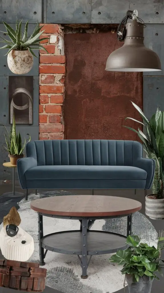
Now, bring in some rusty reds. Think exposed brick or oxidized metal. These warm tones balance out the coolness of the gray and add depth to your space.
To keep things from feeling too heavy, add in some muted blues. A dusty blue sofa or some pale blue curtains can soften the industrial edge.
This color scheme is perfect for lofts, converted warehouses, or anyone who appreciates the beauty in the unpolished. It’s edgy, it’s urban, and it’s unapologetically cool.
11. Tropical Oasis
Close your eyes. Feel the warm sun on your face. Hear the rustle of palm leaves. Smell the salty sea air. Now open them – you’re still in your living room, but it feels like a tropical getaway.
This color scheme is all about bringing the vibrant energy of the tropics into your home. Start with a base of lush greens – think palm fronds and jungle canopies. Use these in your larger pieces like sofas or accent walls.

Now, add in some sunshine with bright yellows. A yellow armchair or some cheery throw pillows can instantly lift the mood of a room.
To really capture that tropical vibe, don’t forget the flowers! Bring in some coral pinks or vibrant oranges in your accessories. A pink vase here, an orange lampshade there – it’s like adding little bursts of exotic blooms throughout your space.
This scheme is perfect for those who want their home to feel like a permanent vacation. It’s lively, it’s fun, and it’s guaranteed to chase away the winter blues.
12. Autumnal Warmth
As the leaves start to turn and the air gets crisp, why not bring some of that autumnal magic indoors? This color scheme captures the cozy, warm essence of fall.
Start with a base of warm neutrals – think creamy whites or soft tans. These act as your canvas. Then, layer in those quintessential fall colors. Burnt orange, like the last embers of a bonfire. Deep reds, reminiscent of ripe apples. Golden yellows, like sunlight filtering through changing leaves.

Use these colors in your larger pieces – a burnt orange sofa, perhaps, or deep red curtains. Then, sprinkle in accents of the other shades. A golden yellow throw blanket, some copper-toned picture frames.
The key to this scheme is texture. Think chunky knit blankets, smooth leather, rough hewn wood. It’s all about creating a space that makes you want to curl up with a good book and a mug of hot cider.
This color scheme isn’t just for fall, though. It can create a warm, inviting atmosphere all year round. It’s perfect for those who love the cozy comfort of autumn, no matter the season.
13. Zen Retreat
In this fast-paced world, sometimes we all need a little peace and quiet. That’s where the Zen color scheme comes in. It’s all about creating a calm, balanced space that soothes the soul and quiets the mind.
Start with a base of soft, muted greens. Think of the gentle hues of bamboo or the soft shade of moss. These colors connect us to nature and promote a sense of growth and harmony.

Layer in some light browns, reminiscent of smooth river stones or weathered driftwood. These earthy tones ground the space and add a touch of warmth.
Finally, bring in some creamy whites. These represent the empty space so crucial in Zen philosophy. Use these in larger areas like walls or flooring to create a sense of openness and possibility.
The key to this color scheme is simplicity. Less is definitely more here. Choose a few key pieces and let them shine. A single piece of art, a carefully placed plant, a beautifully simple vase – each item should have room to breathe.
This color scheme is perfect for those seeking to create a calm oasis in their home. It’s a visual deep breath, a color meditation. In a world of constant stimulation, it offers a much-needed respite.
14. Retro Revival
Who says you can’t turn back time? The retro revival color scheme brings the groovy vibes of the past into the present, with a modern twist.
We’re talking about those classic mid-century colors – avocado green, mustard yellow, burnt orange. But before you start having flashbacks to your grandma’s kitchen, hear me out. When used thoughtfully, these colors can create a space that’s both nostalgic and thoroughly modern.

Start with a neutral base – crisp white walls work best. Then, bring in your retro colors. An avocado green sofa makes a statement without overwhelming the space. Use mustard yellow in your accent chairs or curtains. Sprinkle in burnt orange in your accessories – think throw pillows, artwork, or a quirky lamp.
The key to making this scheme work is balance. Too much, and you’ll feel like you’ve stepped into a time machine. Not enough, and you’ll miss that retro flair. Mix in some contemporary pieces to keep things fresh. A sleek, modern coffee table can ground those vintage-inspired colors.
This color scheme is perfect for those who appreciate a nod to the past but live firmly in the present. It’s fun, it’s nostalgic, and it’s guaranteed to be a conversation starter.
Wrapping It Up
Whew! We’ve traveled through time and space, from tropical paradises to Zen retreats, from the vibrant 60s to the minimalist present. Each of these 14 color schemes has its own unique personality, its own story to tell.
Remember, your home is your canvas. These color schemes are just the starting point – feel free to tweak, adjust, and make them your own. Maybe you’ll fall in love with one scheme, or perhaps you’ll create a masterpiece by combining elements from several.
The most important thing is that your space feels like you. It should reflect your personality, your experiences, your dreams. So go ahead, grab that paint brush, pick up those fabric swatches, and start transforming your space. Your perfect color scheme is out there, waiting to bring your interior design mood board to life.
Now, if you’ll excuse me

