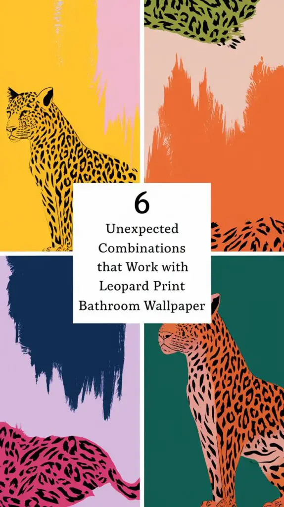
6 Unexpected Color Combinations that Work with Leopard Print Bathroom Wallpaper
This post may contain affiliate links which means we may receive a commission for purchases made through links. Read more on our Affiliate Disclosure Page.
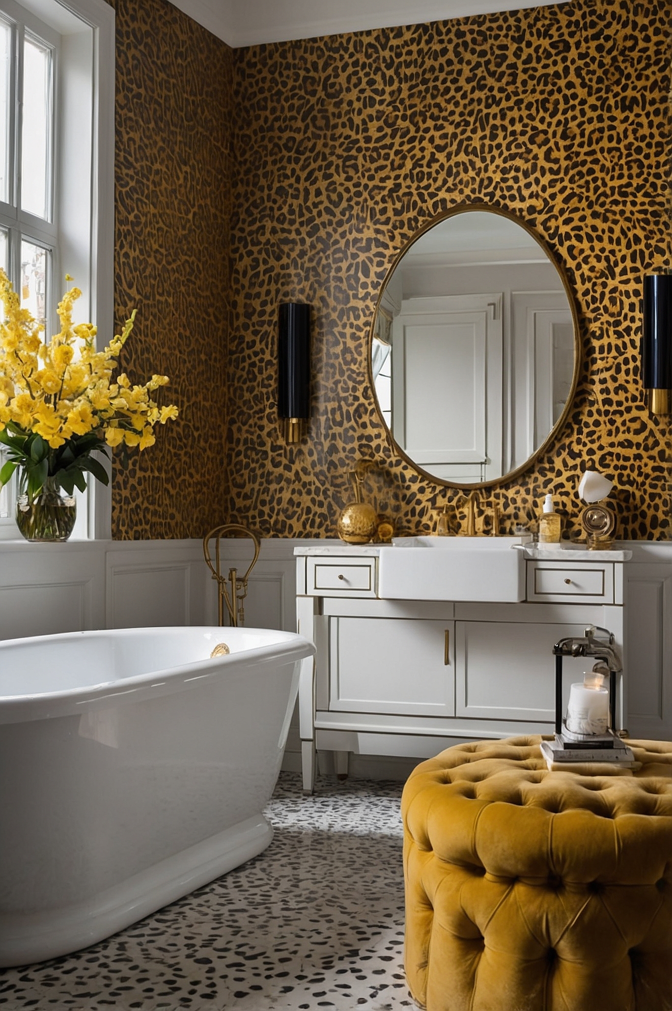
Leopard print wallpaper in a bathroom? This design choice is beyond bold. It’s daring, and it’s absolutely fabulous when done right. But here’s the real challenge – what colors do you pair with such a statement piece?
We’ve all seen the classic combinations. Beige, black, and gold have had their moment. It’s time to shake things up. Let’s dive into six color pairings that’ll make your leopard print bathroom roar with style.
Emerald Green: A Jewel in the Jungle
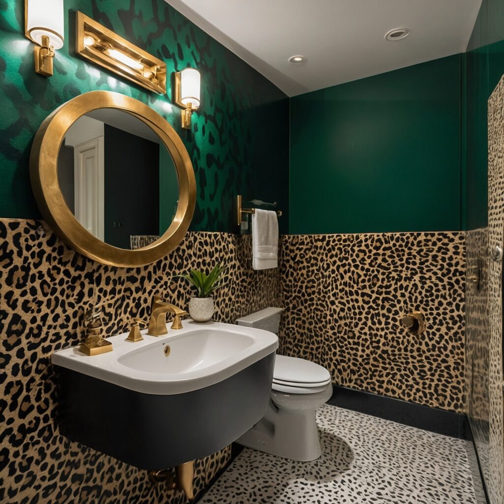
Who says leopards can’t love the jungle? Emerald green paired with leopard print creates a lush, opulent atmosphere that’ll transport you to a tropical paradise every time you step into your bathroom.
The deep, rich tones of emerald complement the warm browns and blacks of leopard print beautifully. It’s an unexpected pairing that just works. Think of it as nature’s color scheme – the spots of a leopard against the dense foliage of its habitat.
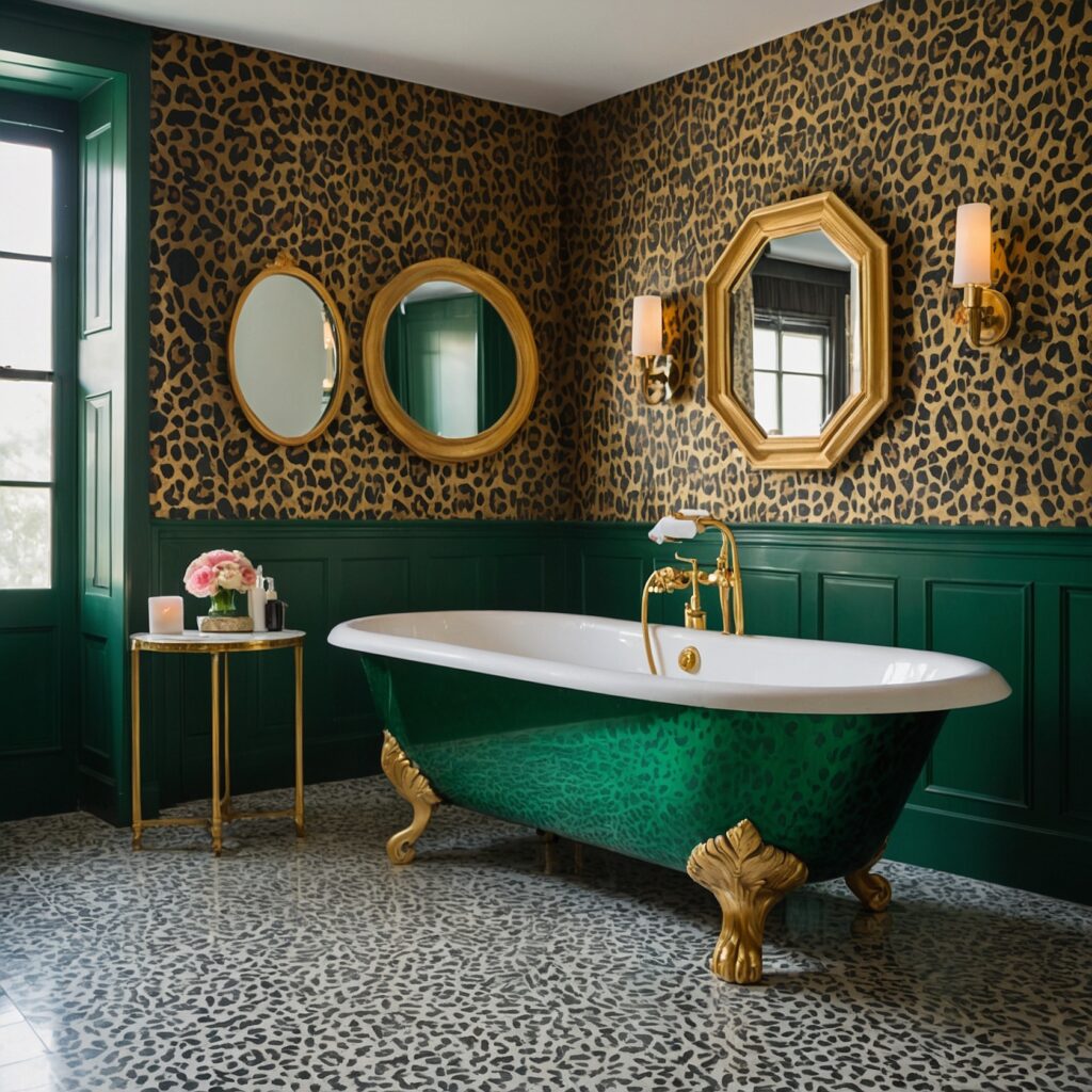
Try painting your vanity a bold emerald green. Or go for green towels and accessories if you’re not ready for a big commitment. The contrast will be striking, turning your bathroom into a conversation piece.
One homeowner, Bethany, took the plunge with this combination. “I was nervous at first,” she admits. “But now, every time I walk into my bathroom, I feel like I’m in a luxury safari lodge. It’s like my little oasis of wild elegance.”
Dusty Pink: Softening the Wild Side
Now, let’s take a walk on the softer side. Dusty pink might seem like an odd choice for leopard print, but trust me, it’s a match made in design heaven.
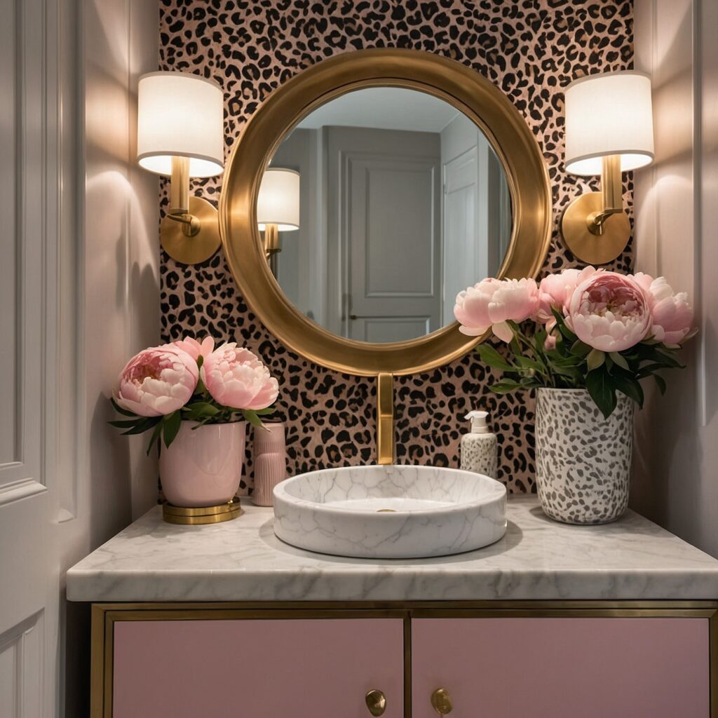
This delicate hue tones down the boldness of leopard print without diminishing its impact. It’s like adding a touch of blush to a fierce cat-eye makeup look – unexpected, but oh-so-right.
The key is to choose a muted, sophisticated shade of pink. We’re not talking bubblegum here. Think of the soft pink of a sunset, or the blush on a peach. This color brings a touch of femininity and warmth to the space, creating a perfect balance with the wildness of the leopard print.
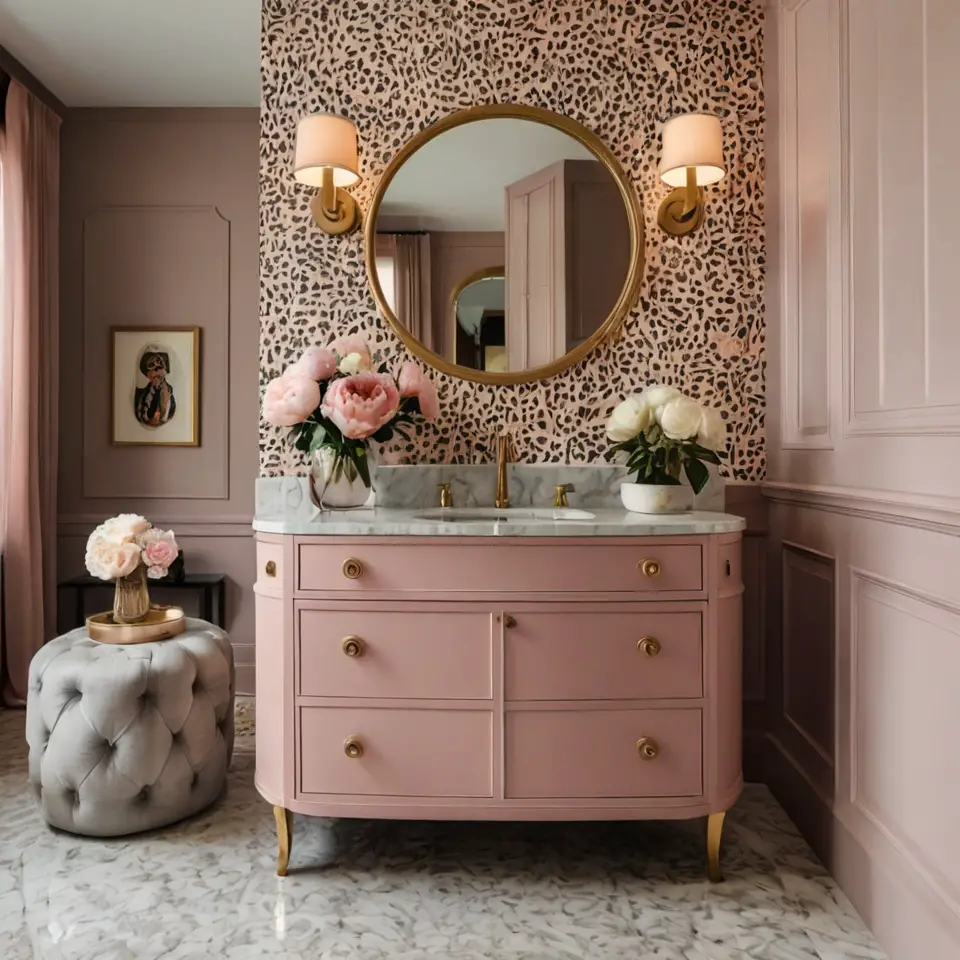
Consider a dusty pink ceiling to draw the eye up, or a pink-tinted mirror to add a subtle glow. Even small touches, like pink hand soap dispensers or a vase of pale pink peonies, can tie the look together.
Navy Blue: Nautical Meets Safari
Navy blue paired with leopard print is like a safari on the high seas – unexpected, adventurous, and undeniably chic.
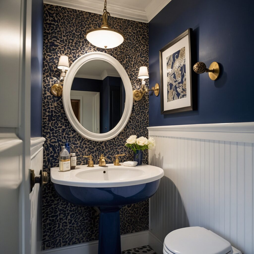
This color combination works because navy blue provides a strong, grounding presence that complements the energy of leopard print. It’s like the calm ocean supporting a wild island – each enhances the other.
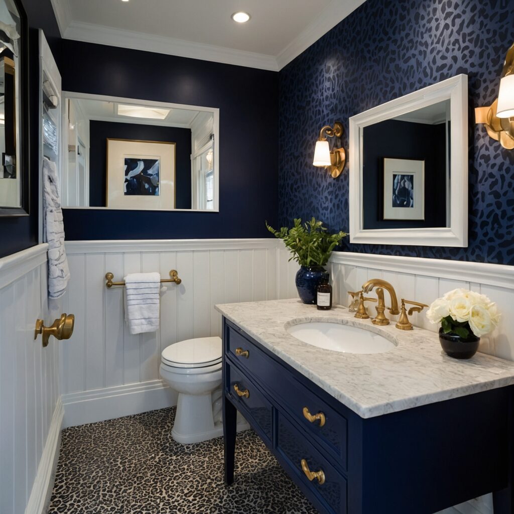
Navy blue can be incorporated through tiles, a painted vanity, or even a bold navy ceiling. The contrast creates depth and interest, making your bathroom feel larger and more dynamic.
One interior designer, Mark, shares his experience: “I suggested this combination to a client who wanted something unique. She was skeptical at first, but now her bathroom is her favorite room in the house. It’s proof that taking design risks can really pay off.”
Mustard Yellow: A Streak of Sunshine
Feeling brave? Let’s talk about mustard yellow. This rich, warm color is like a ray of sunshine cutting through a leafy forest canopy.
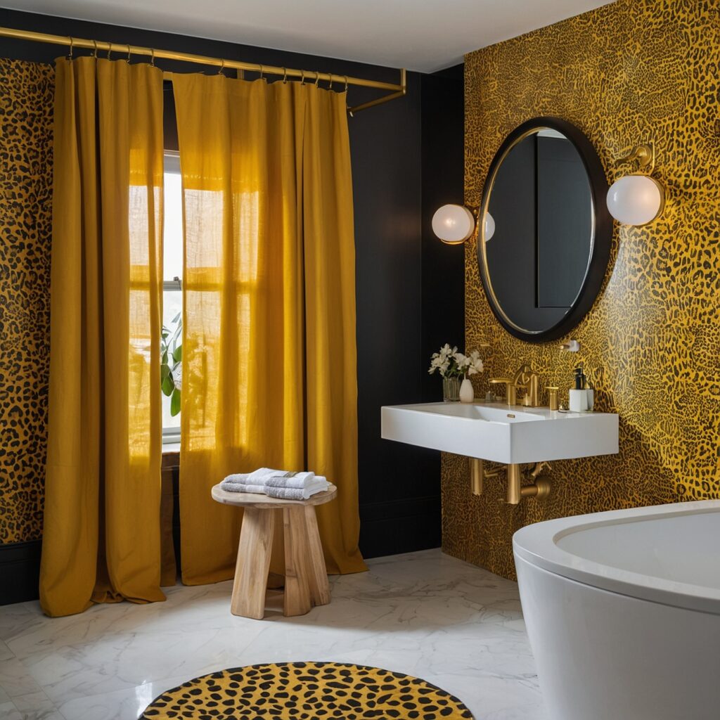
Mustard yellow and leopard print are both bold choices, but together, they create a vibrant, energetic space that’s full of personality. It’s a combination that says you’re not afraid to express yourself.
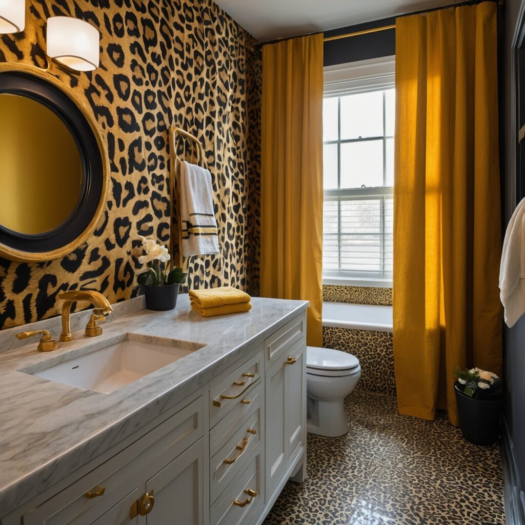
The trick is to use mustard yellow strategically. A yellow vanity or mirror frame can be a fantastic focal point. Or, for a more subtle approach, incorporate yellow through towels, rugs, or artwork.
Lavender: A Regal Touch
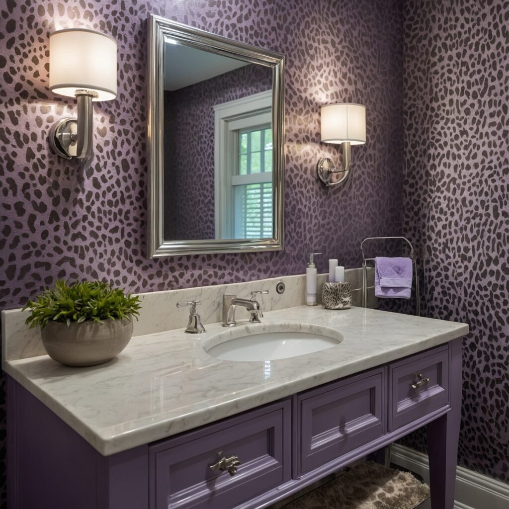
Now, here’s a combination that might raise some eyebrows – leopard print and lavender. But stay with me, because this pairing is unexpectedly elegant.
Lavender brings a cool, calming presence to the warmth of leopard print. It’s like the soft twilight settling over the savanna – serene, beautiful, and just a little bit magical.
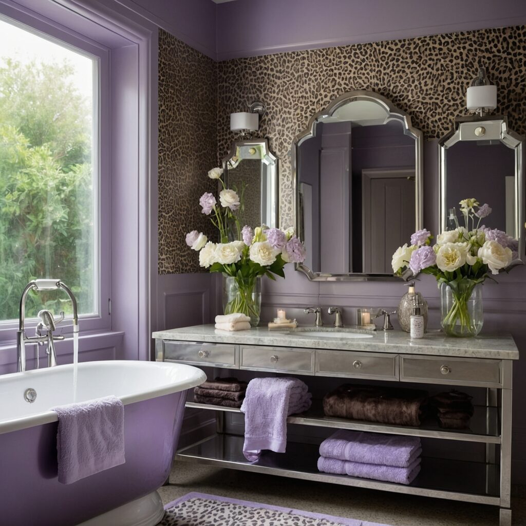
This color works particularly well in powder rooms or guest bathrooms where you want to create a memorable, luxurious experience. A lavender ceiling can add an ethereal quality to the space, while lavender towels or a shower curtain provide softer touches.
One homeowner, Lisa, took this leap of faith. “I wanted something different for my guest bathroom,” she says. “The lavender and leopard combination makes it feel like a boutique hotel. My guests always comment on how unique and relaxing it is.”
Burnt Orange: Embracing the Warm Side
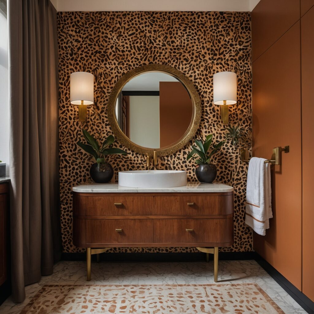
Last but certainly not least, let’s talk about burnt orange. This rich, warm color feels like it was made for leopard print.
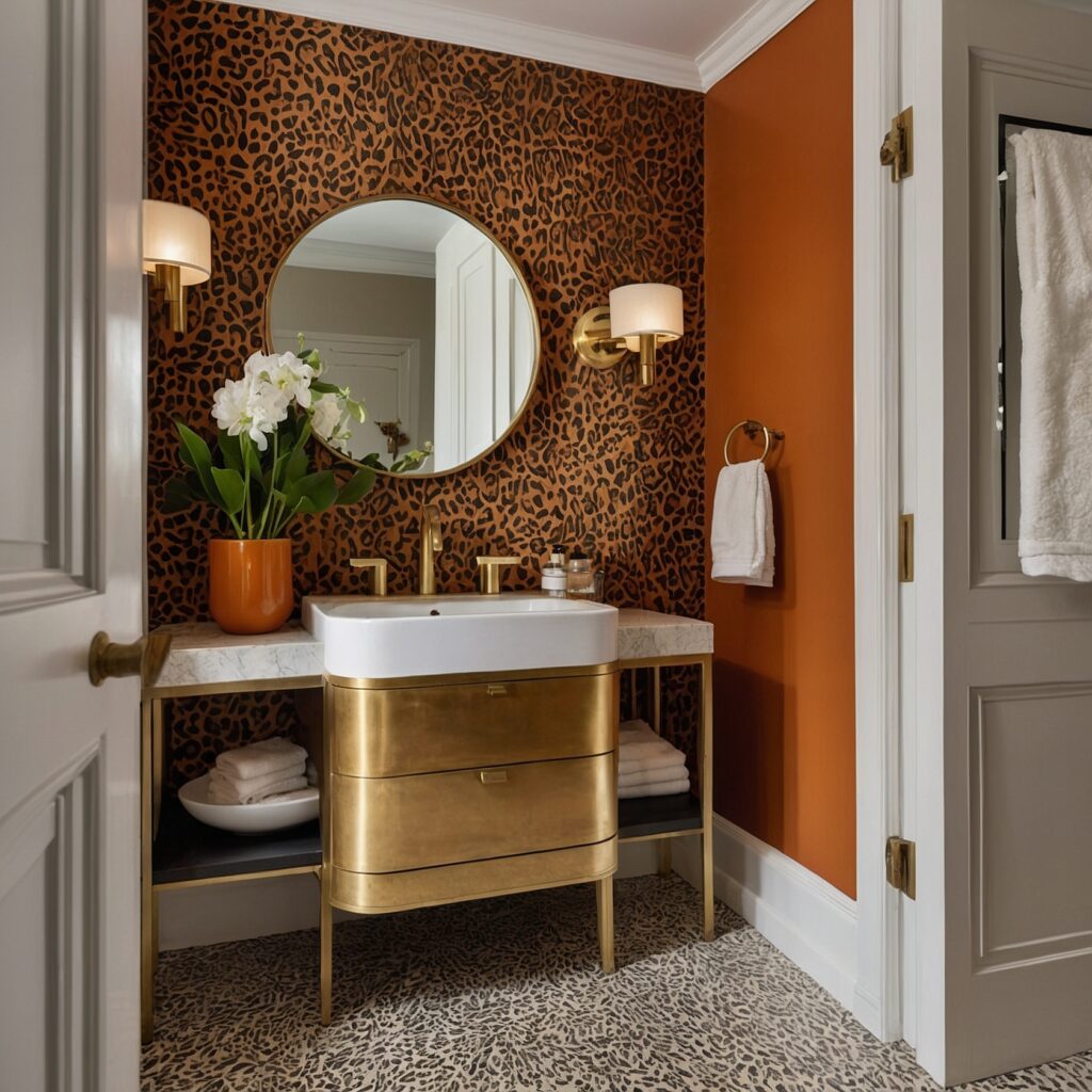
Burnt orange picks up the warm tones in the leopard pattern, creating a cohesive, inviting space. It’s reminiscent of a African sunset, bringing a touch of that magical ‘golden hour’ light into your bathroom.
This color works beautifully for accessories like towels, rugs, or even a statement vanity. It’s bold without being overwhelming, and it adds depth and warmth to the room.
Pulling It All Together
Now that we’ve explored these unexpected color combinations, you might be wondering how to implement them in your own space. Here are a few tips to keep in mind:
- Start small: If you’re nervous about committing to a bold color combination, start with accessories. Towels, rugs, and artwork are easy to switch out if you change your mind.
- Consider lighting: The way your chosen color looks can vary dramatically depending on the lighting in your bathroom. Always test samples in the space before committing.
- Balance is key: While we’re embracing bold combinations here, you still want your bathroom to feel harmonious. Use your chosen accent color strategically to complement, not overwhelm, the leopard print.
- Don’t forget about neutrals: A touch of white, black, or beige can help ground your color scheme and give the eye a place to rest.
- Texture matters: Incorporate different textures to add depth to your color scheme. A fluffy bath mat, sleek fixtures, or a woven basket can all contribute to the overall feel of the space.
Interior design is all about creativity and personal expression. These combinations are suggestions, not rules. Trust your instincts and choose colors that make you feel happy and energized.

